

Twenty Six: Assisting the user with flexible search capabilities when shopping for homeware and giftware products online
Problem
Twenty Six stocks eco friendly products based on customers needs and interests. They support and promote the growth of small, independent, unique businesses linked by the very versatile Chalk Paint™ which empowers a community of creative individuals and established small businesses to flourish.
My challenge was to redesign the website, showcase the new rebrand, increase visitor engagement, improve the user experience and online sales.
The project goals
To conduct User Research to discover the user’s needs, frustrations and motivations.
To build an intuitive online shop to increase sales of ethically sourced gifts.
To categorise over 500 products listings into groups that make sense to the users.
To provide seamless search capabilities so users can find what they need quickly and easily.
To convey the brand values and a strong brand identity.
To educate visitors on how to use chalk paints and upcycle furniture.
As the main distributor of Annie Sloan Chalk paints in Ireland, it was important to help increase the number of stockists in Ireland for Annie Sloan paints.
Increase sign ups for upcycling workshops.
To easily update what's in and out of stock and have transparency of warehouse stock.
My Approach
Twenty Six’s aim for the project was to increase visitor engagement, improve the user experience and to increase online sales. To facilitate this strategy, I undertook a user research approach including:
Content and Imagery Audit to allow Twenty Six to communicate their mission and values in an impactful and meaningful way.
Brand testing and strategy applied to business all touch-points in the business such as business stationery and gift packaging.
Analytics to identify key user journeys and behaviours.
One-to-one interviews and surveys with key customers to explore and validate assumptions of needs and frustrations.
Card-sort to understand how the users categorise products that make sense to them.
User Flows to determine the best e-commerce experience.
Wireframes to test the best content and page structures.
Usability Testing to sense-check my user journey assumptions.

Wireframes to show Home page, Product Landing and Product Detail pages
User Problems
The visitors to the website included people who recently moved into a new home, upcyclers, students of traditional art & design, gift purchasers, who wish to buy products online. Some of the pain points experienced by the users:
Difficult to find what they need. There’s a lack of categorisation of products and search was cumbersome.
Not knowing when items will be back in-stock
They wanted to know how to upcycle furniture using painting techniques online.
It was difficult to sign up to upcycling workshops quickly and easily online.
Difficult to find previously viewed items.
I want to see what products would match or compliment other products that I purchase.

Business problems:
No option to categorise products correctly and separate sale items.
Lack of consistency in branding.
Inventory tracking is extremely time-consuming. There’s a need to be able to update what's in stock and out of stock quickly. The stock fulfilment is linked to the warehouse so the business needed to know what's available in warehouse and in-store.
Provide gift cards to customers that are trackable and easily redeemed in-store and online.
Shipments needed to be streamlined as shipment costs were getting confusing for the delivery company who were dealing with a set delivery cost and it was not reflective of the size or weight of the product.
Brand Criteria
My goal was to convey the brand identity and it’s mission clearly while acknowledging the family history of the shop. The shop had been in the family for previous generations. This was depicted in the logo showing the face of the owner’s mother in a painterly style.
Previously named, ‘26: An Eclectic Mix’ , a term which was confusing for the users, as ‘Eclectic’ was not a well-know term. It brought confusion to the user when tried to guess what that meant.
New Brand Ethos
To inspire homeowners to choose high quality, unique gifts, paints and home decor because with Twenty Six, we want to help make your house a home and inspire your gift of giving.
Four elements were chosen to help should guide the design of Twenty Six’s website. These were chosen to encourage a feeling of; Home, Inspiration, Excitement and Special. While being mindful of the Brand Values; Inspiration, Green-heart and Lifestyle, the design choices seek to evoke a home-comfort emotion in the user when they visit Twenty Six.

Moodboard ideas for brand
Home
Inspiration
Excitement
Special
The Twenty Six style aims to be people oriented and conscientious of their lifestyle needs. The aim of the brand is to greet visitors with a warm embrace when landing on the site and which communicates a sense of the fun and excitement that one associates with a new home.
Choosing the right colours:
Prioritise Home and Inspiration

To further establish a unique visual style, I adopted a specific set of colours from the Twenty Six brand. They are organised into two palettes - primary (at top) and secondary.
A compositional balance between the colour palettes is at the forefront of the design.
The choice of colours must be reflective of the brand guidelines and convey feelings of warmth, character and excitement while evoking a sense of creativity and inspiration.

Exploring style boards
When gathering inspiration, I like to create a style board to see what element might work together. As the brand has a very creative audience with a DIY mindset, it was important to see explore a potential visual language that would appeal to them.
I included the image of the owner’s mother in the favicon of the website to give a nod to the history of the business. The image of the mother’s face was on previous packaging which needed a more updated style so it was treated using an simple outline drawing.
AB Testing on packaging
B
A


AB test results
‘A’ was the preference with 70 votes.
‘B’ received 52 votes.
As ‘A’ was the preference for the customers, and the owner was happy with the choice, we selected it.
Solutions
It was difficult to categorise products such as displaying ‘Furniture accessories’ and ‘Sale’ items. Using a card sort exercise with selected products (that were deemed difficult to label or categorise), I could see how the users categorised the products into categories that made sense to them. Questions such as, ‘where would you expect to find a ceramic door knob?’ helped to understand the user’s mental model when categorising products. A select list of category options were given so we could determine what was the most appropriate category for it.

Cross-linking categories on the site was an issue, but I noted that Shopify product sku template allowed for multiple tagging of items so a homeware product (such as a cup) could display in ‘Homeware> cups’ and also in a ‘Homeware - Sale’ section too.
Gift personalisation: I discovered that the users categorised gift options into occasions or people type. For example in the gift section, ‘Wedding gifts’, ‘New Home’, ‘New Baby’ and for people interested in travel, we labelled it ‘Travel Lovers’.

To facilitate the user’s in their discovery phase, I added a ‘Quick view’ to products so the user could see the product detail at a glance without having to enter and exit the product page. This approach allowed for quick reviews of products to see if they were suitable or not.
Previously, users couldn’t sort the product lists to see price from lowest to highest which was particularly needed on mobile. A simple filter dropdown helped the user to search for products to suit their budget.
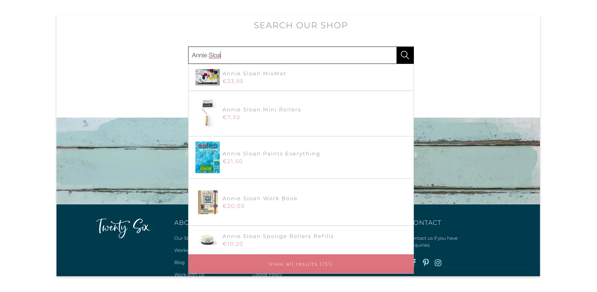
The previous search was problematic as it did not aid the user in finding the products or information as quickly as it could have. The search on the new website allowed for predicted search so the user would have to type less and the results were filtered and visible instantly.
The user was left wondering if and when the product that they wanted would be back in stock. To solve this problem, I added an email address input field beside the product so they user can be notified when the product is back in-stock. This way they were kept up-to-date with their favourite brands and products.

Recently viewed list appeared when the user explores different products. This acts as a short list or bookmarking system for them to see what products they were looking at previously.

Outcomes
Incentivising the user, with ‘free shipping when you spend €60 or more’ banner helped to encourage add-on sales online.
By adding more detailed descriptions and higher resolution images to the product detail pages, the user felt better informed to make a decision about purchasing the product which resulted in higher conversions.
Making the website more responsive to mobile devices, I noted a higher conversions of 73% on mobile compared to the previous year.
The users wanted to find out relevant information about the upcycling workshop details so I added a dedicated Workshop page with relevant information and a book now call to action. This increased in workshop sign ups through the website by 60%.
The business owner reported that the inventory of stock is easier to track saving weeks of work allowing the owner to focus on other important parts of her business.
See more projects

Picseed: Custom content moodboard app
We recognised how time consuming it is to find reputable and interesting content related to the user’s personal interests.